
The psychology of colour plays an integral yet often overlooked role in interior design. Understanding how colours affect moods, emotions, and behaviours can help you transform the rooms in your home into relaxing sanctuaries or lively spaces that promote creativity.
In this article, we will explore the fundamentals of colour psychology and provide actionable tips on how to utilise different hues and colour schemes to design a positive, inviting atmosphere in your living spaces.
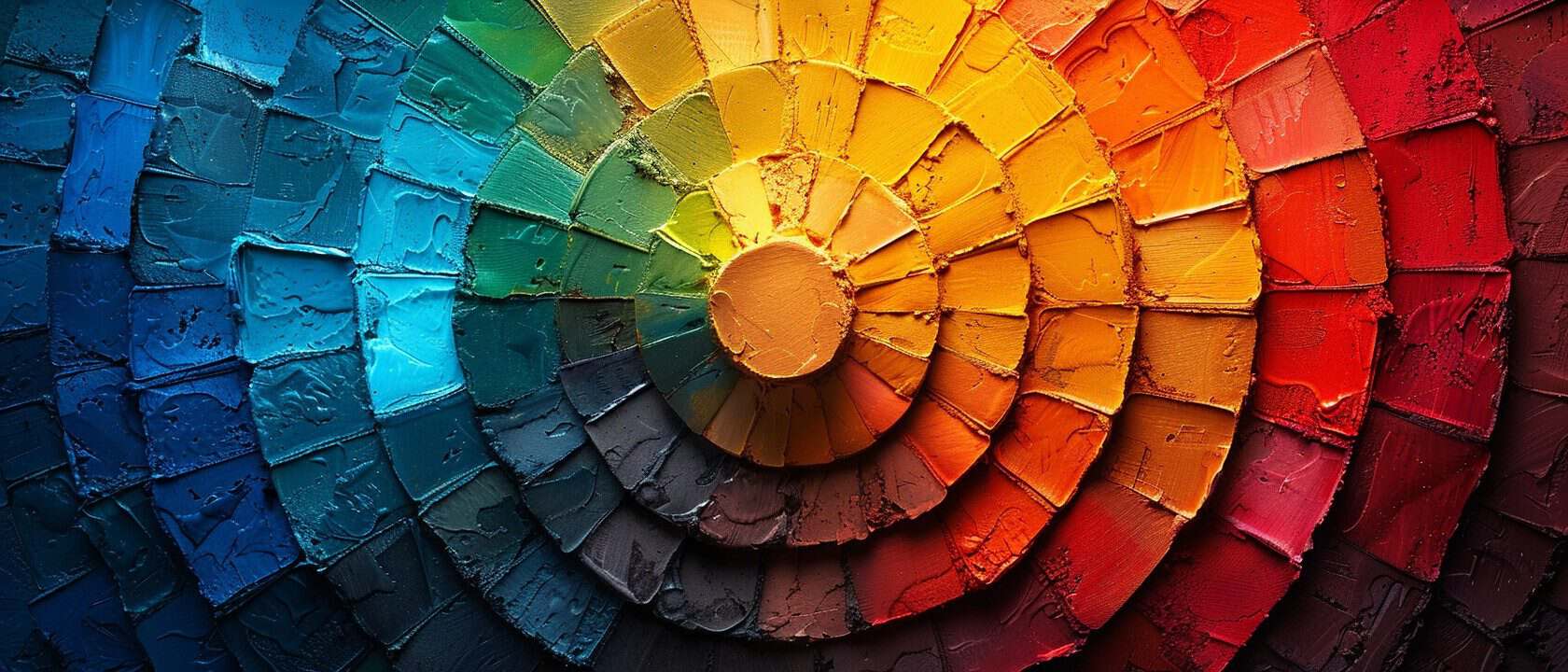
A Primer on Colour Psychology
Colour psychology refers to the way colours impact human perception, attitude, and behaviour on a psychological level. It is grounded in the theory that various wavelengths of light have subtle effects on our nervous system, triggering biochemical reactions that influence emotions and physiology.
Interior designers rely heavily on colour psychology research to determine the best schemes for residential and commercial projects. Something as simple as painting a room blue can foster productivity, clear thinking, and even inspiration. On the other hand, bathing a space in red tones may increase anxiety, intensity, and stimulate hunger.
Beyond influencing emotions, some studies suggest that colour can improve cognitive performance, spark creativity, and affect the accuracy of memory recall. Carefully planning colours for learning environments, office spaces, or rooms where you want to encourage creative flow can yield tangible benefits.
Decoding the Primary Colours
The three foundational colours on the colour wheel are red, blue, and yellow - known as the primary colours. Here’s an overview of their psychological effects and how you can harness them at home:
Red
Red is the most emotionally intense colour. It represents passion, excitement, heat, energy, danger, strength, power, and love. In interior design, red is an excellent accent colour. It draws attention and triggers urgency, making it ideal for highlighting focal points.
Red stimulates appetite, so consider using it as an accent in dining rooms or kitchens. However, limit its use in bedrooms as it may disrupt sleep.
Blue
The colour blue elicits feelings of calmness, relaxation, order, logic, productivity, and serenity. It slows metabolism and produces a calming effect. Blue inspires clear thinking and concentration, making it a handy hue for home offices,
creative studios, or learning spaces. Light shades of blue can also suppress appetite, so avoid using it excessively in dining areas.
Yellow
Yellow conjures up sensations of happiness, hope, optimism, and warmth. It activates memory, stimulates mental activity, and generates muscular energy.
However, in large doses, yellow can trigger irritability and fatiguing effects. Use bright, lemon yellows sparingly as accents. Softer yellows promote wellness and may benefit rooms intended for relaxation and recuperation.

Harnessing Secondary & Tertiary Colours
The secondary colours - green, orange and purple - are created by mixing equal parts of the primary hues. Meanwhile, tertiary colours emerge from mixing a primary and secondary shade. Like primary colours, these derivative hues have unique effects:
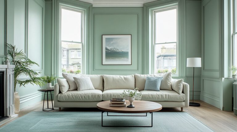
Green
Green is nature’s colour and a vivid symbol of renewal, harmony, balance and environmental awareness. It can alleviate anxiety, promote healing, and impart stability. However, it can also trigger boredom when overused. For home interiors, green works excellently when paired with bright accent colours.
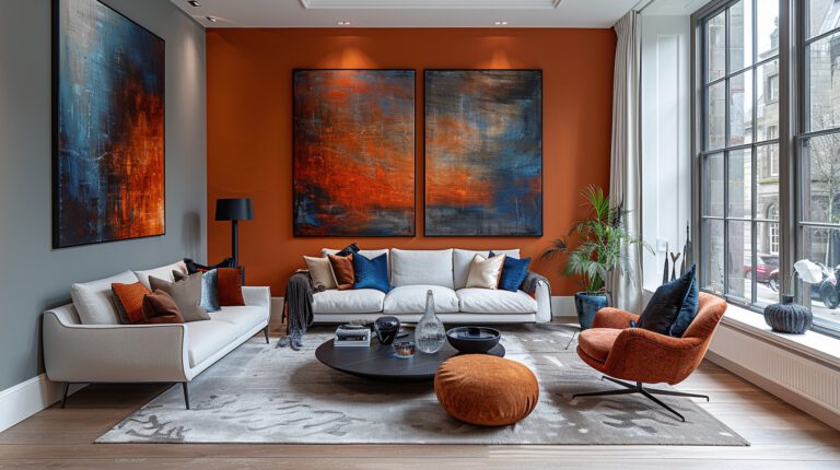
Orange
Representing affordability, fun and creativity, orange enhances enthusiasm and stimulates socialisation and conversation. While vibrant orange tones have youthful flair, softer peach and terracotta infuse sophistication. Use orange as a dynamic accent colour for social spaces. However, limit its use in bedrooms as it may overstimulate.
Purple
In antiquity, purple symbolises wealth, royalty and prestige. Today, purple retains an air of luxury but also stimulates imagination and creativity. Light lilacs and lavenders have a gentle, tranquil quality. Darker plums and eggplants feel richer and more romantic. Use purple for focal walls or key furniture pieces.
Maximising Neutral Colours
White, grey and beige are considered neutral backbone shades. While not intense, neutral colours profoundly impact mood and ambience. Here’s how to capitalise on them:
White
Crisp white enhances feelings of hygiene, efficiency and simplicity. It seems to help focus mental activity and elevate mood. However, too much white can feel sterile. For balance, pair with brighter accent colours. Crisp whites work well in bathrooms, kitchens, laundry rooms and walk-in closets.
Gray
From cool greys to warm taupe tones, this versatile colour bridges the gap between black and white. It dials down intensity but adds sophistication and flexibility. Light greys have an airy, illuminating effect while soft charcoal greys feel decadent. Gray works excellently as a backdrop shade in combination with vivid accent colours.
Beige
The perfect bridge between brown and white, beige has a reputation for dullness but don’t overlook its cosy appeal. Warm beiges foster acceptance, familiarity and belonging. Soft tans can make small rooms appear more expansive. For best results, team with colours from the green and brown colour families.

Creative Colour Combinations
Thoughtfully mixing colours using the basics we’ve covered can take your home’s atmosphere to the next level. Here are some stimulating combos:
Blue and Yellow – This cheerful pairing blends vitality and tranquillity. Think bright sunflowers against a serene sky. Use in family rooms, home offices and creative spaces.
Red and Green – Reminiscent of the holidays, these complementary colours represent ritual, celebration and connection. A red accent wall livened up by verdant houseplants or botanical artworks channels vitality.
Purple and Green – The union of purple and green brings balance while dialling up sophistication. Deep purple accent walls grounded by emerald furniture or light green ceilings and mouldings create an elegant, worldly atmosphere.
Harnessing Colour Psychology for Emotional Benefits
Beyond harnessing combinations, mapping colours to target emotional outcomes can help you design the perfect backdrop for various domestic activities:
- Motivation & Productivity - Opt for cooler blues, greens and purples in home offices and creative workspaces. Yellow accents may uplift mood and support mental clarity.
- Relaxation & Stress Relief – Soft blue-greys, greens and peach tones help muscles relax while soothing nerves. Avoid overstimulation by limiting bright reds and oranges in bedrooms and bathrooms.
- Cordiality & Hospitality – Warm beiges, taupes, tans and peaches infuse cosiness into foyers, family rooms and casual dining areas. Throw in vibrant accent pillows using yellows, oranges or reds.
- Tranquility & Spirituality
– Light ethereal colours like airy blues, violet, lavender and pink impart gentle energy perfect for meditation spaces or sanctuaries for deep introspection.
Understanding Cultural Differences
While human reactions to colour cues share commonalities, cultural norms also influence preferences and perceptions. Red, for instance, signals danger in the West but symbolises luck and joy during Chinese New Year.
When designing for a multicultural home environment, ensure your colour choices respect cultural backgrounds. Consult with family members to determine an acceptable colour palette. Be prepared to tweak schemes to foster inclusion and sensitivity.

Key Takeaways for Your Home
Now that we’ve covered some colour psychology basics plus dos and don’ts, here’s a quick recap of actionable tips:
- Use blue tones to promote productivity, relaxation and clear thinking
- Paint dining spaces orange or red to stimulate appetite and conversation
- Energise home offices with yellow accents to boost positivity and mental clarity
- Choose red bedroom accents cautiously as it may reduce sleep quality
- Alleviate stress with restful greens, blues and peach tones
- Build cosy atmospheres for family spaces using warm beiges, taupes and tans
- Map paint colours to target emotional benefits for each room’s activities
- Ensure colour schemes align to cultural preferences of occupants
In Closing
Harnessing the psychology of colour to enhance your home’s atmosphere requires thoughtfulness about human emotions and behaviours. While unusual colour combinations may look stunning in photos, living with spaces that use colour to elicit positive psychological effects fosters wellbeing.
From supporting rejuvenating sleep and productivity to enabling hospitality and sparking creativity, the hues you choose impacts you and your guests. Consider seeking professional painting and design services for help realising your goals.
Experts can ensure you avoid common mistakes and wasted effort so your home aligns both aesthetically and psychologically.
About Borthwick Decorators Ltd
At Borthwick Decorators Ltd you have found one of Scotland’s leading hand painted and spray painted kitchen companies, where quality, reliability and professionalism come as standard. We are based in Edinburgh, with affiliated branches in Glasgow, Perth, Stirling and Crieff which allows us to cover the whole of Central and South Scotland.
We are a Painting and Decorating Association and Scottish Decorators Federation accredited business that offers all aspects of interior and exterior painting and decorating. All of our tradespeople are fully qualified painters and decorators. We also offer plastering, joinery and multi-trade services in conjunction with our painting and decorating jobs. Residential painters and decorators since 1959.
If you have any questions regarding the painting and decorating services we offer or you would like to book a free no obligation quotation, please don't hesitate to get in touch with us via our online appointment form or alternatively by sending us an email or by telephoning 0131 235 2733 or 0800 772 3973 .
Did you find this blog post helpful? If so, please share it.